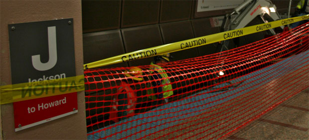
Well, it’s a work in progress.
We launched the new look this weekend. It’s a stripped down design where we’re going for clean and simple.
There’s some improved functionality too, specifically with the comments. They are now threaded. Just click REPLY on the comment of another SUBWAYblogger reader, and your post will show up right under there’s. It has also been made easier to figure out how to use the Gravatars…which we recommend every regular blog commenter use.
So it’s a bit of a throw back to the very first version of SUBWAYblogger, with a two column format.
What do you think? Be honest…but not mean 🙂
Hey! Looks very great, and cleaner than the older version. Seems to load faster 😉
Congratulations!
LikeLike
I like it.
LikeLike
I dig it. But it sort of bugs me how the title of the post doesn’t align with the sponsors module.
LikeLike
I like! Very clean.
LikeLike
@Mike:
Yeah I agree. Working on the styles for that right now. I have a special box above the first post that comes up for featured posts. When there’s nothing there, it doesnt quite collapse all the way.
LikeLike
I’ll admit, I really like it. So clean and minimalist! Keep up the great subway blogging!
LikeLike
Thanks everyone. If you notice something not working correctly, please let me know. Plop you note in any comments section. I read all the comments so I will see it. Just let me know what Browser you are using and PC/Mac. Thanks again!
LikeLike
I actually like the way the two columns don’t align at the top.
LikeLike
@Hugh Briss – Ventibate: Yeah we actually made the difference more significant. At first, it was only slightly uneven.
LikeLike