Have you seen the new (sorta) KICK map for the subway. It’s a new subway map concept by a design firm that thinks they have a better way to demonstrate how the subway lines run.

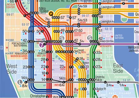
So you get the basic idea by seeing the side by side comparison above. The KICK map has a “line” for each line…go figure. This is supposed to make it more obvious where each train line runs and branches off.
So what’s the deal with “KICK” ? That’s what we wondered too. We thought it was going to be a catchy acronym for something. Turns out the design company’s name is KICK. Minor let down.
In any event, the MTA quickly cut down the idea three years ago and again recently. They think the map isn’t geographically correct. We can see that. The lines do get a little “fat.” It kinda makes it look like the subway line is a few blocks wide when we all know it isn’t.
Eddie Jabbour, (the designer) is sticking with it. He’s going to keep tweaking it until it’s something the MTA will be forced to seriously consider. With all the Internet buzz, who knows, maybe there will be a big push behind it.
Although, I don’t see many New Yorkers having trouble with the current map. Maybe the KICK map could be the tourist version? A Subway for Dummies version perhaps.

Kick map = instant revulsion. I honestly cannot express how much I can’t stand looking at that thing. It would drive me insane seeing if that thing was adopted. Seriously.
LikeLike
I happen to like it alot actually. Even if its not 100% geographically accurate it lets you know which trains stop where. I especially like that you know which line is express vs local. For native New Yorkers it may not seem like a big deal but for tourists and newbies it will be a great help. If the MTA won’t adopt it KICK should at least sell it to tourists.
LikeLike
I happen to love the design, would like to see this piece of modern art happen, and if not, then I hope Kick will make prints available for sale…Reminds me of cool 70s rainbow patterns on TV!
LikeLike
I love the KICK map. It makes reading the various lines so much more easier. I bet that the MTA though the “geographical inaccuracies” wouldve led to a law suit.
LikeLike
As a Londoner (our map, unchanged for over 70 years, bears exactly no resemblance to exact geography, and is considered a design icon), I’d like to say that, although I agree that the Vignelli pure schematic map doesn’t work for a city like NYC, the KICK is probably slightly better than the MTA one. It gives a sufficient guide to location without getting overcomplicated – which the MTA one does in downtown Manhattan.
However, it could probably do with some tweaking – but in any case, it’s definitely a better tourist map than the MTA one, and I’d rather have that in my Time Out Guide than the MTA hyperaccuracy. If I wanted that, I’d get a street map.
LikeLike